How to Choose a Paint Color That Matches Your Flooring
Choosing paint colors can be exciting—until you realize the wall color that looked perfect in the store clashes with your floors. It’s a common frustration for homeowners and one that can make even the most stylish design feel off balance.
Your floors are the foundation of every room, influencing how wall colors look under different lighting and finishes. The key to creating a cohesive design is understanding how to choose a paint color that matches your flooring—and doing it with intention.
This guide walks you through a professional approach to color harmony, helping you create balance, contrast, and flow between your walls and floors, whether they’re wood, tile, vinyl, or carpet.
How to Choose a Paint Color That Matches Your Floors
Creating harmony between your wall and floor colors takes more than picking shades that simply look good together — it’s about understanding undertones, contrast, and balance. Follow these three professional steps to confidently match paint colors with your flooring and achieve a cohesive, designer-quality look in any room.
Step 1 – Identify Your Flooring Material and Its Undertone
Every flooring material has a dominant color and a subtle undertone that affects how your wall paint appears under different lighting. Recognizing these undertones is the first step to choosing a paint color that complements—not clashes with—your floors.
Hardwood Flooring
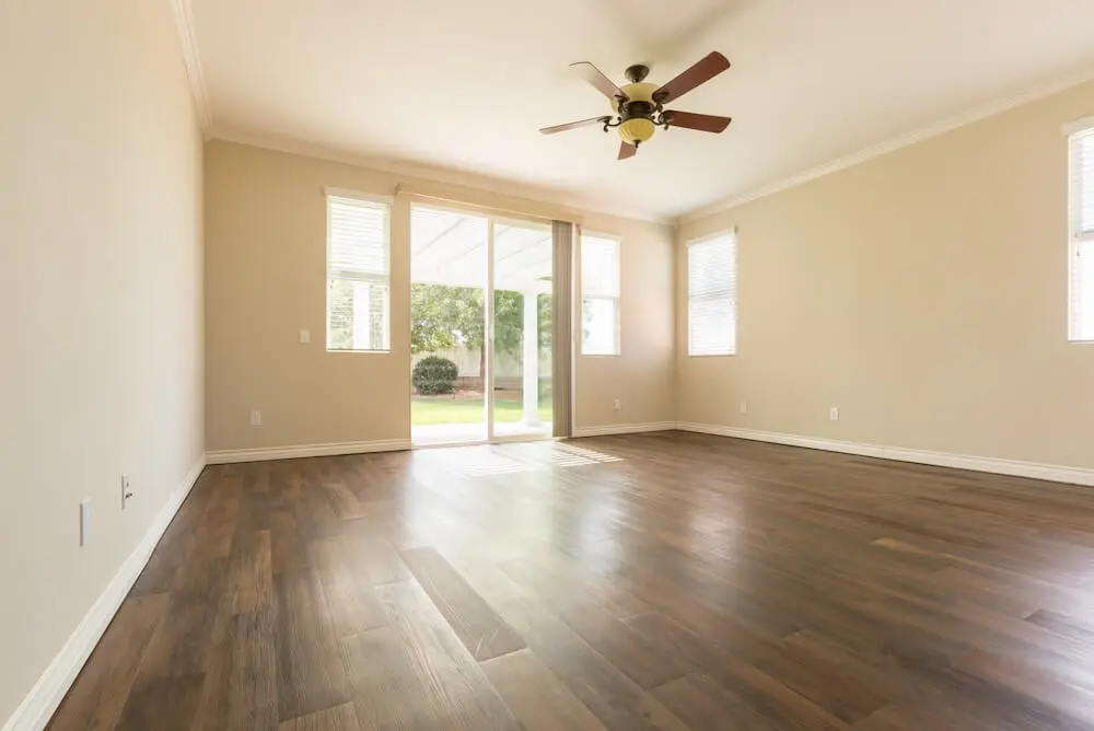
Hardwoods like oak, maple, and walnut often reveal red, yellow, or gray undertones beneath their surface stain. Knowing these undertones helps you choose wall colors that bring out the floor’s warmth or balance its richness.
- Red oak leans warm and pairs beautifully with earthy tones like taupe, olive, or cream.
- White oak is more neutral, making it versatile enough for both warm and cool paint colors.
- Dark walnut adds a sense of depth and luxury—ideal for pairing with lighter, cooler wall shades that create contrast.
Tile and Stone Floors
Natural stone and ceramic tile vary widely in undertone based on the material and glaze. Understanding whether your tile reads warm or cool helps guide your wall color palette.
- Travertine or beige tile → warm undertones → pairs with creamy whites, terracotta, or warm grays.
- Slate or gray porcelain tile → cool undertones → try dusty blue, greige, or muted sage.
- Marble → often has blue or green veining → complements soft whites or cool pastels.
Luxury Vinyl Plank (LVP) and Laminate
Luxury vinyl and laminate flooring mimic natural wood or stone but can vary significantly in tone and pattern.
- Examine grain direction, tone, and texture closely before choosing paint.
- Neutral grays and beiges in flooring offer more flexibility and let your wall color take the spotlight.
Carpeted Floors
Carpet introduces both color and texture, often blending multiple fiber tones.
- For cohesion, choose a wall color that reflects one of the subtle thread tones.
- In rooms with dark or plush carpet, a lighter wall shade can visually open up the space and balance heaviness.
Step 2 – Decide Between Matching or Contrasting Tones
Once you’ve identified your flooring’s undertone, the next step is deciding whether your walls should match or contrast. It sounds simple — but this is where even confident DIY decorators often go wrong. What looks “close enough” on a paint swatch can turn mismatched or flat once applied in real lighting conditions.
Professional painters and color consultants don’t rely on guesswork. They use color theory, undertone analysis, and controlled lighting tests to create combinations that feel balanced and intentional — not accidental. Here’s how they approach both tone-matching and contrast decisions the right way.
Matching Tones – Subtlety Done with Skill
A tone-on-tone look can feel seamless and elegant, but it takes expert precision to pull off.
While homeowners might simply choose a wall shade similar to their flooring, professionals understand that undertone alignment is what makes or breaks the result.
- Why it matters: Two “beige” tones can actually carry opposite undertones — one warm, one cool — creating a dull or clashing effect.
- How pros handle it: Experts use paint sampling under multiple light sources and adjust by tint percentage, ensuring walls blend smoothly without blending too much.
- The result: A cohesive, calming look that feels natural and balanced across your entire space.
Contrasting Tones – Bold Balance Without Overpowering
Contrast brings character and definition to a room, but poorly chosen contrasts can make a space feel disjointed. Professionals use color-wheel pairing and an understanding of how light affects perception to achieve contrast that enhances — not competes with — your flooring.
- Why it matters: DIY contrast choices often rely on “trendy” colors that don’t consider undertones, light exposure, or flooring material.
- How pros handle it: Color consultants identify whether your flooring is cool (like gray or slate) or warm (like oak or travertine) and then select opposing tones that create contrast while staying harmonious.
- The result: A visually dynamic space that feels expertly balanced, never chaotic.
Accent Walls – Where Expertise Shines Most
Accent walls are deceptively complex. The wrong placement or tone can throw off room balance, but the right one can transform the space.
- Why it matters: DIY accent walls often fail because the chosen color doesn’t relate to the flooring or the light source.
- How pros handle it: Professionals analyze natural light direction, undertone consistency, and spatial proportion before selecting a wall and color.
- The result: A feature wall that feels intentional, grounding, and perfectly tied into the rest of the palette.
Matching and contrasting tones aren’t just about color preference — they’re about technical accuracy, undertone mastery, and light behavior.
Because in color design, the difference between “almost right” and “perfect” is expertise.
Step 3 – Choose a Color Family That Complements Your Floor (The Professional Way)
Once you’ve decided whether your room needs color harmony or contrast, the next step is choosing a paint color family that complements your specific flooring. This is the stage where many DIY decorators lose confidence — because paint and flooring rarely behave the way they appear on a swatch.
Professionals, however, approach color selection scientifically. They analyze light reflection values, undertones, and surface textures to ensure your chosen wall color enhances your flooring — not competes with it. Here’s how that expertise plays out across different materials.
Light Wood Floors – Creating Subtle Warmth and Balance
- Light woods like maple or white oak bring brightness, but they can quickly look washed out if paired with overly cool wall tones.
- Painters use low-sheen finishes on walls to complement matte wood textures and avoid glare that exaggerates undertones.
Dark Wood Floors – Depth Without the Gloom
- Dark hardwoods like walnut or mahogany create richness, but can easily make a space feel heavy if paired with the wrong wall color.
- Experts adjust paint sheen (e.g., eggshell vs. matte) to reflect just enough light back into the room, enhancing dimension without shine.
Gray or Cool-Toned Tile – Keeping It Sophisticated, Not Sterile
- Gray, slate, or porcelain tile flooring reads cool, but that doesn’t mean your space should feel cold.
- Pros test color samples under both natural and LED light to ensure consistency throughout the day — something most DIY tests skip.
Beige or Warm-Toned Tile – Keeping Harmony, Avoiding Dullness
- Beige, cream, or terracotta floors radiate warmth — but that warmth can overwhelm if not balanced properly.
- Professionals sometimes use two coordinated wall shades (main + accent) to introduce depth without harsh contrast.
Patterned or Multi-Tonal Flooring – Simplifying Complexity
- Multi-tonal flooring (like stone mosaics or patterned LVP) already carries visual weight, so the walls must calm the eye — not compete.
- Choosing a color family that works with your flooring isn’t about picking what “looks good in the store.” It’s about understanding undertones, light behavior, and proportional contrast — the core of professional color theory.
Why Professional Advice Matters for Perfect Color Coordination
Choosing a wall color that complements your flooring sounds simple — until you realize how many factors affect how a color actually looks once it’s on the wall. Undertones, light direction, sheen level, and flooring texture all interact in ways that even the most confident DIY decorator can’t always predict.
That’s why professional painters and color consultants aren’t just convenient — they’re essential. They combine technical skill, trained color perception, and years of field experience to create results that feel balanced, cohesive, and timeless.
Start with the Floor to Get Color Harmony Right
Choosing a paint color that works with your flooring isn’t only about style — it’s about creating flow, light balance, and a sense of cohesion that feels effortless. When floor and wall colors are properly aligned, your home appears brighter, more spacious, and expertly finished.
Here’s what to remember:
- Start with your flooring — it sets the foundation for every design choice.
- Identify undertones before you pick a paint shade.
- Use contrast or cohesion deliberately — both can work when planned well.
- Always test paint next to your floors in real lighting conditions.
- Balance sheen and texture to control how color is perceived.
If you’re unsure where to start, let a professional guide the process. Their trained eye for undertones, materials, and lighting can turn guesswork into confidence — helping you achieve the kind of balance that feels curated, not accidental.
Need expert help choosing the right paint color for your floors? Request a personalized color consultation and get it right the first time.